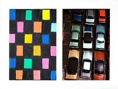
Stephen Colbert: Now why $700,000,000,000 exactly, when these days you can purchase a bank for 3 pounds of ground chuck and an old bicycle wheel? Fed Chairman Ben Bernanke explained...Ben Bernanke: Just as when you sell a painting at Sotheby’s you don’t know... nobody knows what it is worth until the auction’s over. Then people know what it’s worth. I think it’s the same thing.Stephen Colbert: Art is an excellent analogy.
Because I think a lot of people are looking at our economy right now and saying, “my five year old could have done that.”
Tuesday, September 30, 2008
The Collapsing Economy is Like... A Work of Art
From The Colbert Report, Wednesday, September 24, 2008:
Wednesday, September 24, 2008
Cute Load
This Thursday I have video in a screening at mini dutch (a space with the brilliant motto "another apartment gallery"). Curated by Catie Olson, the program is entitled Cute Load. My piece, Unpacking Playtime, examines alternative structures of painting and the ostensible impossibility of pushing it forward. Also taken on is the argument many an uninitiated viewer expresses at the sight of modern and contemporary art, "my BLANK could do that!" In this case, it's testing if that's something my cat could do. Using a "Kitty-Casso" cat painting kit I received for Christmas, my cat and I set out to make a masterpiece. So you have serious aesthetic investigation and a funny animal video.
Thursday September 25 @ 7:30p
mini dutch
3111 W Diversey Ave
More info:
> SPIDERBUG
> PASS THE MINI DUTCHY
Thursday September 25 @ 7:30p
mini dutch
3111 W Diversey Ave
More info:
> SPIDERBUG
> PASS THE MINI DUTCHY
Wednesday, September 17, 2008
Confronting the Contemporary

Installation view of Gary Hume's exhibition, Door Paintings, at Modern Art Oxford
I recently read the review of the exhibition of Gary Hume’s career-starting Door Paintings at Modern Art Oxford on Artforum.com by Ana Finel Honigman. While the review is clear and concise, I disagree on the interpretation of the work and it seems terse, even for a short review. Granted, I have not seen the exhibition, but I have indeed seen Hume’s work, including his Door Paintings, and am familiar with his work. I encountered Hume first at Sensation in 1999 at the Brooklyn Museum of Art. A distinct memory is the introductory wall text leading into the exhibition space seeking to draw attention away from the few scandalous pieces. It essentially pointed out that while there were strange and unusual works, on the whole the exhibition was mainly comprised of painting, and that was the core of Sensation.
It was strange unsettling painting like I’d never seen before. It was about as far away from the directness I was accustomed to in the German Expressionists and the Abstract Expressionists. Even the sparse sensibilities of Cy Twombly were no preparation for this. I was interested in Frank Auerbach, not The Day the World Turned Auerbach, 1992, by Glenn Brown. Since then I have grown to love his work, the strange faux brutal ironic party paintings of Martin Maloney and the sleek and gaudy sheen of Hume. At the time, I found Hume’s painting symptomatic of, not, “as candy, a sweet reprieve from the diet of otherwise bitter and rough YBA work that sustained the English art scene throughout the ’90s,” as Honigman states. Sensation was a strange unsettling trip for a young artist, and right in the center were Hume’s disquieting paintings rendered in colors no one should ever have invented, let alone placed next to one another. I remember leaving the exhibition and thinking, where were all the paintings that were supposed to be there? Looking back at the catalog, it was evident there were some, but they didn’t register as painting to me. They were all removed, withdrawn painting. You had Marcus Harvey’s Myra, 1995, a comment on a nanny child serial killer that to Britain was what Chris Ofili’s The Holy Virgn Mary, 1996, was to Rudy Guiliani and Christians in America. Harvey’s Myra was not a painting so much as a conceptual art object that took the form of a painting. It’s funny, I forget Ofili was even in the show. He is mainly remembered as a scandal, not an artist. His reputation now seems separate from that. Of course there was also Jenny Saville and her awful giant nude paintings. I hated those. The thing is, there wasn’t any painting in the show I liked. I wanted to like it, I did, but there was nothing for me at the time. Sensation was full of painting that made me think these people hate painting. That is a common refrain these days. But it is really a question of taste. It’s like Jeff Koons, you may not like his work, but would he really be keeping up with it, all these years, and to such a level of perfectionism if he hated art? It’s a little absurd to think so. People are at odds over taste.
In short, Sensation was my first real encounter, face to face, with postmodern art. Art that was completely removed from modernism. I was about to say, “art without faith, art without out emotion, art without sincerity.” But none of that is really accurate. Even the faith bit. That, I think is the most common misconception of art that is deemed “postmodern.” A term which now seems to just be another period on the timeline, approximately 1980-2000. The reality is that postmodernism is just is all those things. It IS art with emotion, sincerity and even faith. Those concepts are just embodied in new and strange ways. Postmodernism tries to define or position itself in opposition to those ideas, but results in affirming them, or engaging them in its own way. It is a mistake of modernism to think that it embodies all those things and that other periods do not. Art throughout time has had all the romantic qualities that modernism seems to have laid claim on, these ideals shift, and their forms change.

Gary Hume • Dream • 1991
+ enlarge
This uneasiness is never felt so much as in relation to painting. For many reasons it has come to be the medium that symbolizes “Art.” And as such becomes a subject of intense contemplation. The “death of painting” is part of the cycle of death that occurred repeatedly throughout the 20th century and continues on today, a tradition in itself. Like most traditions it persists despite being constantly disproved. There’s death of modernism, now being re-examined or recycled for its useful parts; the death of all “Art,” which continues to be created; and the end of history. The Soviet Union may have fallen, but China and North Korea persist, Russia is retreating into authoritarianism, and the new enemy to war with indefinitely is fundamentalist Islamic terrorism, or just the Middle East in general.
The bad boy Neo Expressionism of the late 70s and 80s isn’t postmodern at all. Even calling it by that name perpetuates all the “neo’s” and “isms” of the modern. And the artists associated with it are not ironically being the macho man painter, they are embodying that modernist character, just in a big 80s way. Maybe that anachronistic urge to revive or return to the era of a heroic Picasso-esque myth can be viewed as a signal that “painting has died.” But it is certainly not postmodern. The painting in Sensation, that was postmodern, and interestingly revived the medium, since it was such a true and marked change from the likes of Schnabel or Baselitz as well as proper modernism.
The Young British Artists finished grad school 20 years ago this year, and put together that Freeze show, ushering in a new era of hip youngsters mixing art, curating, partying and money with the MFA, or post graduate study as it is termed in the UK. But some of the art really is good. Sensation is thee example of that epoch, specifically, those odd, odd paintings.
While technically paint on canvas, to me the similarity ended there. I was young, and I’m sure many have their own examples of such an encounter as a young artist. For me, and I think a lot of others, this was a time when we were still moderns. We knew of art in the museums, and new there was “contemporary art.” But didn’t really think it mattered. When you are eighteen there is you, your friends, and Picasso, Matisse and Dali [i.e. the dead artists of history]. You are completely ignorant of thinking of what “now” is or might be. This isn’t necessarily confined to the young though. Plenty of people of all ages carry on this way far into their adulthood.

Gary Hume • Door • 1988 • Hume's first "Door Painting"
+ enlarge
Sensation was, in a sense, someone taking me aside and saying, “I’m sorry to have to tell you this, but there has been 50 years of art going on since deKooning that you need to be aware of.”
Nowadays the prospect of a survey of Hume’s Door Paintings is something I’d very much like to see. The doors, more than any of his other paintings, seize the viewer. Compared with them, the birds and the models, contour paintings in the same sickly sweet sherbet color scheme are easy stuff. Those graphic works are digested thusly, “interesting drawing, big, household enamel on aluminum, get it, it’s attractive, next.” They are palatable because people are familiar with birds and plants and the human figure. And they are rendered in a pleasant way, in line drawings and bright colors that relate to what is popular today. Look at the design and color schemes in trendy magazines or stores; Hume’s paintings fit right in. The doors, to a certain extent, fit in as well. But the doors, they are much more problematic, and deceptively simple. Their sense of space and their use as a tool for philosophical contemplation on space, proportion and representation is of considerable interest which goes beyond mere attractiveness.
I was baffled when I first saw them. I didn’t even know how to look at them; this was, in a way, a whole new language for me. They obviously reference the abstraction of Malevich, Mondrian and Barnett Newman, but why were the shapes arranged like that (both in the paintings, and as a group of panels) and in those colors? The title was Dolphin Group No IV, 1991, what the fuck was that all about, how do these have anything to do with dolphins? It never occurred to me that these could be read as both pure geometric abstractions AND representational. I tried to understand them the way the “soft abstraction” of early modernism is based on reality. Making an image that, as crazy and “abstract” as it is, is still a representation of something rooted in traditional uses of space, has the base concept of “painting as a window,” and is named for the subject it is a painting of. So even the style of titling was new to me. I didn’t get the paintings’ relationship to doors until much later, their patterns seemed like an arrangement of shapes that were based on some order, but one I didn’t get. I was convinced that it somehow referenced some idea of “dolphin” in some recondite way.

Gary Hume • Dolphin Group No IV • 1991 • gloss paint on MDF board • 4 panels, total 222 X 643CM
+ enlarge
Of course then the faces come out of them. The ones with the circular windows look like skulls. Honigman describes them: “Twin circles, placed side by side at the top of many of the panels, resemble vacuous eyes, giving the doors a friendly anthropomorphic appearance, and the simple patterns are soothing and sweet.” I can see that a little, in reproduction. But when you see them in person, and you see your own reflection, blurred a little, it’s not the same. Those vacant eyes are dead, if you get the idea of a face at all. The doors are quite impenetrable, the surfaces so solid and smooth that the viewer is cut off. In some ways they are impossible to see, since they reflect so much of the room they are in. Quite hospital like. Where the colors are gaudy, and everything is reflective, shiny and clean. Not at all what Honigman says, “his paintings’ glossy shine, pleasant palette, and clean surfaces are antithetical to their maudlin and distressing inspiration.” I find the paintings take all the discomfort created in an institutional setting and distill it. Perhaps the colors’ pleasantness is derived from their ubiquitous popularity, but to me it is just that harsh colors and combinations thereof have become popular. The sensation produced is repulsion and attraction.
This is also brought about by the space the Door Paintings create. The colors of the various shapes fight against one another in an optical way although we know where the figures and the ground are once we are trained to look at them that way. The doors, when in non-objective mode, appear as a solid field on which smaller shapes reside. Or they appear as an endless void that is either infinitely deep or incredibly shallow in which parallel forms exist. This is what happens when you witness a true two-dimensional moment in a three-dimensional world. Your brain refuses, or is unable, to ignore the question of which form is on top and how far apart are they from the ground. And is the ground another flat plane or is it like outer space—a limitless void that recedes indefinitely? It’s not possible to look at anything as purely two-dimensional.
Further complicating this troubled operation is the fact that these are based on real objects, and painted at a 1:1 scale. The colors are all wrong to look like doors with windows and metal plates. So in many of the paintings it is impossible to think of it as a door because all that spatial formal relationship stuff is going on at the same time. Then there’s the way doors, especially those with metal plates rather than knobs or handles, function as super flat, near two-dimensional objects in our world. So while you are thinking about the visual play of the forms, you are thinking about the way doors are the same thing, but in real life, not a colorful painting. Doors lend themselves extremely well to this operation of two versus three dimensions. And in proportion, doors are also reasonably painting-sized and shaped, that’s why all these ideas of perception can effortlessly slide back and forth on top of one another. When you bring in contour drawing, that sort of representationalism, with birds, plants or people, it doesn’t work. You are looking at flatness of course, but it is the old way of thinking about space rendered in two-dimensional form. There is a fundamental shift, because even if you were to render a bird at the size it is in real life on a panel that is bird-shaped, the bird is still round and three dimensional and the painting is not. With the doors, the paintings are OF and ARE what they represent. Doors, as flat as they are, are still slightly three-dimensional. And paintings, as flat as they are, are also three-dimensional. This is why the doors work and with the contour drawing paintings look nice but are easily apprehended.

Gary Hume • Four Doors I • 1989/90 • oil on canvas in four parts, 7FT 10 1/8IN x 19FT 5 7/8IN • from Artforum.com
Some of the doors are hung in groupings as multiple paneled pieces. This in some ways shuts down some of their door-ness and places them further in the art object world. But they exist oddly there. A painting of a door, on its own, as a door is one thing. But a bunch of doors, all side by side. That again stirs things up for me. Now I have to look at is as a multi-paneled abstraction. And I always wonder where to draw the line. Is this some big arrangement of shapes, or is this a group of discrete paintings all hung together?
The paintings’ opticallity is thoroughly modern, even Greenbergian. That they are doors, and are directly related to their objectness, is not. It is also interesting to think how places like hospitals resonate with modernist architecture and design: cold, simple, clean, austere and sterile, just like the door paintings.
While this essay has focused on the painting, in particular Gary Hume’s, in Sensation, the exhibition as a whole marked one of the significant moments as a young artist where I was forced to confront contemporary art and ideas. It may not be as crucial to a total history of recent art as it is in more own personal development, but it stands as a noteworthy exhibition nonetheless. From its receptions in various contexts, to the implications of public and governmental response, the problematics of Charles Saatchi’s involvement to the wide breadth of work itself, Sensation, and its catalogue is something I find myself returning to often. The opportunity to learn new ways of seeing something as old hat as painting via Hume’s work, is just one example.

Gary Hume • Jim (Little) • 1991 • enamel on aluminum • at Matthew Marks, New York booth at 2007 Art Basel Miami Beach • photo by Joanne Mattera
> ARTFORUM
> MOD ART OX
Wednesday, September 03, 2008
The End is the Beginning
FROGATE UPDATE Artforum.com reports in its International New Digest that according to the Süddeutsche Zeitung the Pope in fact did not in fact condemn Martin Kippenberger's Fred the Frog sculpture. "The statement that allegedly came from the pope was in fact a response from the Vatican’s state secretary to a letter from Pahl." Readers will of course remeber Pahl as the local magistrate that went on a hunger strike in protest of the Kippenberger work until he passed out.
---
WEEKENDERS ON OUR OWN
While the wreckers of civilization—not Throbbing Gristle, the Republican Party—are having their [satirical comment removed at the request of the RNC] convention Art or Idiocy? is reporting on art.
The major weekend for art in Chicago is typically considered the one in the spring when some iteration of a fair or fairs takes place, but the real time of year is September. Like elsewhere, the first Friday of the month marks the start of the gallery season, along with the new primetime television shows.
THURSDAY 9/4
 VONZWECK is closing. Has closed. I thought it ended in the spring, but coincidentally, this weekend begins with its last show. Hosted by Anthony Elms and Jacqueline Terrassa, this final hurrah is a group exhibition of all the previous solo artists. Knowing Philip von Zweck, this might be the end of the space as such, but hardly will be the last we hear from him.
Opens (6pm)
Starts Thursday Sep 4
Thursdays (6–9pm) through September 25 and then that's it!
VONZWECK at the Barn (2845 W Altgeld St)
> VONZ
FRIDAY 9/5
 Angles in America
Curated by Terry R. Myers
Rhona Hoffman opens with a group show with Mary Heilmann, Jim Isermann, Gordon Matta-Clark, Robert Overby, Laura Riboli, and Jennifer West. I’m particularly interested in Heilmann’s work as well as what Myers has put together. Myers is a critic and historian I enjoy reading, and his focus on Heilmann’s Save the Last Dance For Me from Afterall is on my reading list.
Opening 5 – 730p, up through 10/11
118 N Peoria
> R-HOFF
---
Rowley Kennerk keeps getting more cerebral withQuién esta? he said, but no one spoke back.
There was someone there and they had been there. There was no one there. There was someone there and they had been
there and they had not left but there was no one there. And brings artists whose work I’m eager to see: Marcel Broodthaers
Jan Dibbets, Gaylen Gerber, David Lieske
I talked to him once about the frustration over seeing shows and whether or not to review them badly. “You can always dog me,” he said, “I won’t take it personally.” The only problem is that Rowley Kennerk consistently puts on some the best shows I’ve seen, and has one of the most solid programs.
Opening 6 - 8p, up through 10/11
Rowley Kennerk Gallery
119 N Peoria St #3C
> ROWLEY
---
 At 65GRAND, a space I’m affiliated with, is Brain Kapernekas’ first solo exhibition with the gallery, Deadfall. Kapernekas’ work is easy to describe in one sense, but impossible in another. Works that appear to be straightforward representational images seem to function as pure abstraction. It is dissociation. To look at paintings by Brian Kapernekas is to experience the sensation of losing your grasp on objects and images you think you understand. It is a sense of alienation from icons of world around you, light coming through barns doors, campfires, Martian landscapes. There, that’s a good explanation. He also does sculpture, while the subjects are more sinister, skulls, crows and on, they aren’t nearly as disturbing to view. They are in fact humorous and playful, which the paintings are a little bit too.
Opening 7 – 10p, up through 10/4
1378 W Grand, entrance on Noble
> ALLCAPSNOGAPS
---
 I had heard Western Exhibitions was moving, possibly to one of the spaces inhabited by Three Walls, and apparently it has. Just as a summer exhibition in the old mercilessly hot factory space sweated on beyond the entry through the unlit derelict Lisa Boyle space, final show still on the wall, the move seems to have just come about with little fanfare.
The first exhibition in the new space is Stan Shellbarger’s second solo with the gallery, Walking Books. Shellabarger makes performative conceptual art focused on the body. Using adjectives that are apt, but perhaps repulsive, I would describe it as old school hardcore performance art. Shellabarger seems firmly rooted in a tradition coming right out of the 60s and 70s, and carries the powerfully reductive torch of body art onward.
Opening 5 – 9p
119 N Peoria St, 2A
> WX
---
 Continuing on the abstraction summer group show, Thomas Robertello has a solo show entitled Places to sit and conquer by young New Yorker Patrick Berran, a painter keeping the fires of Helen Frankenthaler and Jules Olitski (maybe a little Jonathan Lasker) burning while fronting the punk band Apeshit. Apeshit, an excellently named band, recently performed at the Whitney Museum, so they might be an art punk band.
Opening 6 – 9p, up through 10/4
939 West Randolph Street
> ROBERTELLO
---
 Margot Bergman, who takes thrift store paintings and makes them truly bizarre, in the manner of Asger Jorn or Enrico Baj presents new work in The Dust Blows Forward, The Dust Blows Back at Corbett vs. Dempsey. The title of the exhibition, I am told, derives from a Captain Beefheart lyric.
Opening 5 – 9p, up through 10/11
1120 N. Ashland
> CvsD
SATURDAY 9/6
 Lloyd Dobler continues the Chicago spirit of worthwhile apartment galleries with a solo show of work by Autumn Ramsey, painterly paintings in the quirky “contemporary” mode appear to have a touch more than the average fare. Plus they got the info on the show up on their site, unlike many, many other commercial spaces in the city.
Opening 6 – 10p, up through 10/18
1545 W Division, 2nd Flr
> SAY ANYTHING
---
 I’m on the fence about the work of Jason Meadows, but that’s based on work from 2005. At Shane Campbell we’ll see where the work has gone in the past three years.
Opening 6 – 8p, up though 10/11
1431 W. Chicago Avenue
> SHANE
SUNDAY 9/7
 If you can make it to the fourth day of this weekend, on the far west side is devening projects + editions. The main event is Jin Lee’s photos, floating world, which are kind of boring and average, but have a certain quality that you can’t easily dismiss. In the “Off Space” is said, unsaid, work by Aline Cautis. Her nests of diagonal lines built up through layering of watery media produces an argyle-like pattern that is attractive, sympathetic and a little bit omionous, like being trapped by one’s own obsessive hopes and anxieties.
Opening 4 – 7p, up thorugh 10/8
3039 W Carroll, 3rd Flr
> DP+E
---
WEEKENDERS ON OUR OWN
While the wreckers of civilization—not Throbbing Gristle, the Republican Party—are having their [satirical comment removed at the request of the RNC] convention Art or Idiocy? is reporting on art.
The major weekend for art in Chicago is typically considered the one in the spring when some iteration of a fair or fairs takes place, but the real time of year is September. Like elsewhere, the first Friday of the month marks the start of the gallery season, along with the new primetime television shows.
THURSDAY 9/4
 VONZWECK is closing. Has closed. I thought it ended in the spring, but coincidentally, this weekend begins with its last show. Hosted by Anthony Elms and Jacqueline Terrassa, this final hurrah is a group exhibition of all the previous solo artists. Knowing Philip von Zweck, this might be the end of the space as such, but hardly will be the last we hear from him.
Opens (6pm)
Starts Thursday Sep 4
Thursdays (6–9pm) through September 25 and then that's it!
VONZWECK at the Barn (2845 W Altgeld St)
> VONZ
FRIDAY 9/5
 Angles in America
Curated by Terry R. Myers
Rhona Hoffman opens with a group show with Mary Heilmann, Jim Isermann, Gordon Matta-Clark, Robert Overby, Laura Riboli, and Jennifer West. I’m particularly interested in Heilmann’s work as well as what Myers has put together. Myers is a critic and historian I enjoy reading, and his focus on Heilmann’s Save the Last Dance For Me from Afterall is on my reading list.
Opening 5 – 730p, up through 10/11
118 N Peoria
> R-HOFF
---
Rowley Kennerk keeps getting more cerebral withQuién esta? he said, but no one spoke back.
There was someone there and they had been there. There was no one there. There was someone there and they had been
there and they had not left but there was no one there. And brings artists whose work I’m eager to see: Marcel Broodthaers
Jan Dibbets, Gaylen Gerber, David Lieske
I talked to him once about the frustration over seeing shows and whether or not to review them badly. “You can always dog me,” he said, “I won’t take it personally.” The only problem is that Rowley Kennerk consistently puts on some the best shows I’ve seen, and has one of the most solid programs.
Opening 6 - 8p, up through 10/11
Rowley Kennerk Gallery
119 N Peoria St #3C
> ROWLEY
---
 At 65GRAND, a space I’m affiliated with, is Brain Kapernekas’ first solo exhibition with the gallery, Deadfall. Kapernekas’ work is easy to describe in one sense, but impossible in another. Works that appear to be straightforward representational images seem to function as pure abstraction. It is dissociation. To look at paintings by Brian Kapernekas is to experience the sensation of losing your grasp on objects and images you think you understand. It is a sense of alienation from icons of world around you, light coming through barns doors, campfires, Martian landscapes. There, that’s a good explanation. He also does sculpture, while the subjects are more sinister, skulls, crows and on, they aren’t nearly as disturbing to view. They are in fact humorous and playful, which the paintings are a little bit too.
Opening 7 – 10p, up through 10/4
1378 W Grand, entrance on Noble
> ALLCAPSNOGAPS
---
 I had heard Western Exhibitions was moving, possibly to one of the spaces inhabited by Three Walls, and apparently it has. Just as a summer exhibition in the old mercilessly hot factory space sweated on beyond the entry through the unlit derelict Lisa Boyle space, final show still on the wall, the move seems to have just come about with little fanfare.
The first exhibition in the new space is Stan Shellbarger’s second solo with the gallery, Walking Books. Shellabarger makes performative conceptual art focused on the body. Using adjectives that are apt, but perhaps repulsive, I would describe it as old school hardcore performance art. Shellabarger seems firmly rooted in a tradition coming right out of the 60s and 70s, and carries the powerfully reductive torch of body art onward.
Opening 5 – 9p
119 N Peoria St, 2A
> WX
---
Continuing on the abstraction summer group show, Thomas Robertello has a solo show entitled Places to sit and conquer by young New Yorker Patrick Berran, a painter keeping the fires of Helen Frankenthaler and Jules Olitski (maybe a little Jonathan Lasker) burning while fronting the punk band Apeshit. Apeshit, an excellently named band, recently performed at the Whitney Museum, so they might be an art punk band.Opening 6 – 9p, up through 10/4
939 West Randolph Street
> ROBERTELLO
---
 Margot Bergman, who takes thrift store paintings and makes them truly bizarre, in the manner of Asger Jorn or Enrico Baj presents new work in The Dust Blows Forward, The Dust Blows Back at Corbett vs. Dempsey. The title of the exhibition, I am told, derives from a Captain Beefheart lyric.
Opening 5 – 9p, up through 10/11
1120 N. Ashland
> CvsD
SATURDAY 9/6
 Lloyd Dobler continues the Chicago spirit of worthwhile apartment galleries with a solo show of work by Autumn Ramsey, painterly paintings in the quirky “contemporary” mode appear to have a touch more than the average fare. Plus they got the info on the show up on their site, unlike many, many other commercial spaces in the city.
Opening 6 – 10p, up through 10/18
1545 W Division, 2nd Flr
> SAY ANYTHING
---
 I’m on the fence about the work of Jason Meadows, but that’s based on work from 2005. At Shane Campbell we’ll see where the work has gone in the past three years.
 Opening 6 – 8p, up though 10/11
1431 W. Chicago Avenue
> SHANE
SUNDAY 9/7
 If you can make it to the fourth day of this weekend, on the far west side is devening projects + editions. The main event is Jin Lee’s photos, floating world, which are kind of boring and average, but have a certain quality that you can’t easily dismiss. In the “Off Space” is said, unsaid, work by Aline Cautis. Her nests of diagonal lines built up through layering of watery media produces an argyle-like pattern that is attractive, sympathetic and a little bit omionous, like being trapped by one’s own obsessive hopes and anxieties.
Opening 4 – 7p, up thorugh 10/8
3039 W Carroll, 3rd Flr
> DP+E
Subscribe to:
Posts (Atom)