• Hurricane Katrina & Art More • Brian Ulrich's Incentive
• Times-Pic on NOMA • In depth info on Kenneth Snelson
• Rebecca Morris
contact electronically? • artoridiocy@yahoo.com
So first of all, "openings night," which makes it sound like a local production of Briggadoon, is not about the art. It is has something to do with art, but it isn’t about it. Art is the excuse to come out and be sophisticated, run into people you know, and maybe, if you’re lucky, catch a glimpse of a local curator. But mainly it is to drink, and then go out for better drinks afterward. It can be very nerve-racking, and full of social anxiety, especially for young artists. There is a lot of power and ego being thrown around from everyone involved. There is mad sexual tension, and fear of failure. Failure to get laid, failure to sell some art, failure to network and so on.
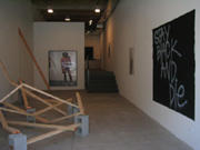
Going around town to the openings last week, I contemplated the idea of not having art at the opening for a show at all, and just putting it up on Saturday for regular gallery hours. Not even as a smarmy conceptual “gesture” just as being blatantly pragmatic. You don’t want the work damaged, people have trouble seeing it, it’s all a big mess. But I think most people wouldn’t stand for it. Maybe graduate students who are just learning about the idea of nothing being more brilliant than something, but that is about it. And besides, you want money, and you have to have something to sell. Even if it is an arrangement of broken 2x4s and cinderblocks.
It sounds like I made that last bit up. But I didn’t, it’s a piece by Rashid Johnson in his solo show, Stay Black & Die. Which is a bad season opener for mmg because there was nothing there to really buy.
Installation view of Rashid John Stay Black and Die at Monique Meloche
Dematerialized art is on the way out... for now. People want stuff to hold on to. Not as easy to hold on to as drawings, whose popularity is also waning, but something more substantive than a 30 second DVD you have to manually replay every time you want to see it. Davis/Langlois who had the season opener at mmg last year were much more pleasing. They were bullshit stoners, but it was about that, and the work was great. It looked great, it had skill, you didn’t have to think about it too much, unless you wanted to. Then it was kind of iffy. But today I still find myself thinking about that show with fondness, so there must be something going on there, right? I Against I was an odd arrangement of photobased paintings that were threaded together by loose ideas of Rastafarianism, the cosmos, religion and other dreamy things. In effect, it was a conceptual, no linear narrative installation. But it was all in your head, man. And it is something I have grown to like.
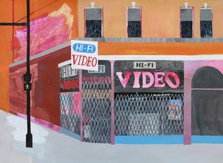
Carolyn Swiszcz Hi Fi Video at Wendy Cooper
Wendy Cooper Gallery was very blah and standard, which it seems to fall into more often than not. Wendy Cooper does have its moments, however this show was not one of them. The headliner, Carolyn Swiszcz, did nothing for me other than getting excited about noticing the Hi-Fi Video store I occasionally drive past. Across the street Bill Woolf at Aron Packer was doing so much more with flattened out geometric cityscapes. His work was rich and beautiful. Precise. There were windows with all sorts of tiny art references and vignettes. There was complex Dubuffet or Max Ernst decalcomania going on. Gigantomachy figures in the rustic pines encircled by the interconnecting LSD.
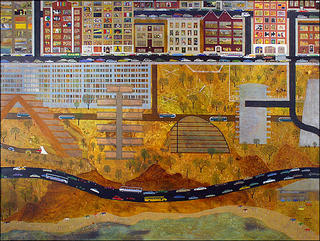
Bill Woolf at Aron Packer
In Cooper’s project space was Wendy White, much better. Wait no, it was more of that brightly colored trash assemblage everyone is doing today.
That was the main problem. Everything was very contemporary, no one was taking risks. It was all “of the moment,” it was all saying, “photograph me, I’d look great in Artforum!” This is a little odd, if you think of Rashid Johnson’s photo of himself, johnson and all, is “more of same” but it is. Also odd is how well Paul Klein scathingly put Johnson’s work:
“Some pieces are great enough to be mightily impressive and some seemingly so shallow I wince. Sometimes I see Rashid as the pithy, perceptive commentator (a la Chris Rock) on what it means to grow up black. Sometimes I see him as an opportunist calculating what he can get away with without having to put in real substance. (It is unfortunate that in our society any artist of color must make a decision about playing the race card. Race is an issue in America and even if an African-American artist avoids the issue - by so-doing, he or she is still addressing it.) So, where would Rashid’s work be without race? Why do white people buy a jersey inscribed “White people like me?” If white people are going to fall all over themselves to show how tolerant and accepting they are, we have to expect black artists to play into that. Rashid Johnson is talented. He certainly is affable. Unfortunately I see him playing in the shallow end of the pool of issues about race in America, jumping up and down, yelling “look at me – look at me. Throw money at me and you’ll feel better about yourself.” Well, it’s working, and that’s too bad. It’s time we grow up. I’m eager to see what Rashid will do when he tires of this successful game of white people liking him.” (sorry to quote at such length)
Siebren Versteeg When Right is Left from Determinationat Rhona Hoffman
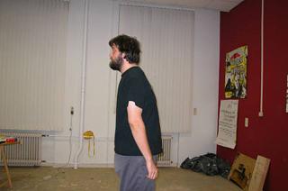
Siebren Versteeg at Rhona Hoffman was very disappointing. This is because I have really grown to like his work. The cement cube with tiny graffiti around the bottom of it (Vietnam Memorial) from the summer group show does much more than this whole solo show of new work. This show seems catchy and gimmicky. The tiny photo of himself reversed (When Right is Left) is nice because it is tiny and on a wall by itself. At first it seems like a pathetic snapshot, but then it confuses you. It is odd and well put together, and a nice play on a standard Photoshop idea, but not much else. Oh, it could also be a political refernece. There was also a limp attempt at “the red states” vs “the blue states,” but that was almost a year ago. Isn’t the point of tech art that it is immediate? Like the news ticker in Coca-Cola font piece he made. Opening night is urban excess in the wake of Katrina, why not comment on that? What do I get from this show? This guy loOoOOOves his Mac.
Mike Peter Smith ...and other stories at Bodybuilder & Sportsman
Mike Peter Smith’s work at Bodybuilder & Sportsman is good, but there is too much of it. It became tons of models and toys, like a display of someone really good at making dioramas, but not curating. About half as much as what is up, should be up. Then you could focus more on each individual object instead of feeling crowded in. Each individual object, by the way, is skillfully rendered perfection. Humans like in tiny space homes carved out of asteroids, with every detail of such a life lovingly accounted for. In another sculpture we see from one side all the seams, glue and Styrofoam, from the other, the ravine and the pickup truck that’s careened down it.
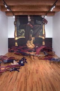
Geoffry Smalley installation of Future Flat World at Gescheidle
Geoffery Smally at Gescheidle was also quite good. Especialy considering how his work has evolved tremendously, and in this body has gained substance and content. Before his work seemed mainly about hiways and cutout shapes. From that comes the installation at Gescheidle; huge cutouts of amalgamated icons for tanks, aircraft, etc. painted in hi gloss autobody paints. And the colors aren’t bad either, dark, muted maroons, navy blue and so on. Like giant game pieces from Risk, scattered over the floor, with a controlling figure presiding over it all. Smally achieves something very difficult with political work, it is directly about war, power and nepotism, but it is pulled off in a which smartly ties in history. The large mural of a suited figure with combat boots in the seat of power brings in history painting, portraits of monarchs and rulers and the adage about the victor writing history. The mural also brings up last fall’s opening show about Halie Selassie (Davis/Langois) at mmg talked about earlier. In an almost identical scene, the deified royal sits regally in power.
In a completely different mode, are the tiny little pencil drawings of Bush et al. These beautiful, timely and well executed drawings artfully capture the arrogance, pigheadedness and tomfoolery of the government.
At Bucket Rider was a load of Surrealist rubbish, but in the project room was a single large photo by Jason Lazarus ...And Then Finally, I Remembered. It was a blandish landscape of a cemetery. Some plywood boards added a nice beige to the pale green of the grass and the pale blue of the sky. These colors made the sunny day seem real, and to take you right there. Later I learned it was Emmett Till’s grave. That added a whole new twist to things. It was not heavy handed at all because I didn’t even realize it until later. There was also the tie in with Jeff Wall’s flooded grave piece. The two are so similar. So here we have Lazarus’ (apropos) “fake” Jeff Wall being a real grave. That is how art gets made. I can enjoy this piece on so many levels!
Down in Pilsen at Polvo the vibe was completely different. The show was well attended, but didn’t feel as though it were overrun by too many hipsters or yuppies. There wasn’t the feel of trying to act cool or important or impressive. And it was actually about the art. You could view it and there were interesting discussions happening. Unfortunately, it is the hipsters which make a scene and yuppies which pay the bills. It is a great thing that Chicago has at least three major neighborhoods of art. And a fourth with Westown.
- - E. Wenzel

1 comment:
glad you liked the emmitt till piece,
for more work check out
www.jasonlazarus.com
at your convenience.
best, j
Post a Comment